
Writing
En & Em
Avoid the dash drama and learn more about what the two types of line separators are meant to do and not to do! Read More »
Avoid the dash drama and learn more about what the two types of line separators are meant to do and not to do! Read More »

They have stood the test of time and they still serve a role. Learn more about the elements of stellar business card design. Read More »

CSS Resets are a thing of the past with the functionality folded into bootstraps and other tools. Here is a primer for anyone interested in their usage before it was so ubiquitous. Read More »

Here’s a practical guide written just for designers on how copyright works. Read More »
Bird by bird is a wonderful book by Anne Lamott that I endorse for writing, creativity, business, and life. None of it is practical information. Read More »
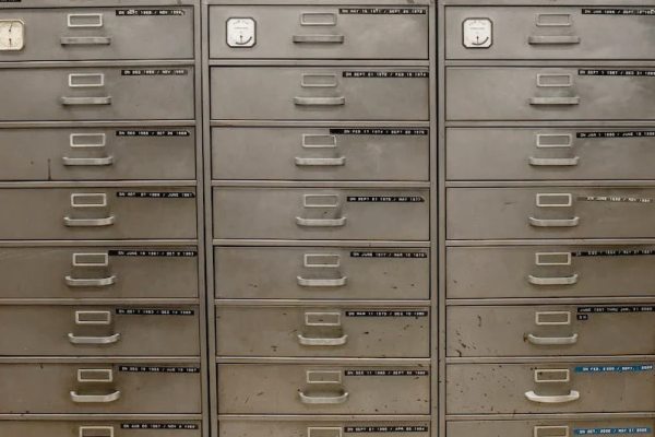
If you have had a long career, we probably share the same problem. Where do we put all the samples? Find out how I deal with mine. Read More »

Let's take a quick down memory road and examine what is the meaning of potential and how it fits in the creative world. Read More »